Introduction
Data are a set of facts, and provide a partial picture of reality. Whether data are being collected with a certain purpose or collected data are being utilized, questions regarding what information the data are conveying, how the data can be used, and what must be done to include more useful information must constantly be kept in mind.
Since most data are available to researchers in a raw format, they must be summarized, organized, and analyzed to usefully derive information from them. Furthermore, each data set needs to be presented in a certain way depending on what it is used for. Planning how the data will be presented is essential before appropriately processing raw data.
First, a question for which an answer is desired must be clearly defined. The more detailed the question is, the more detailed and clearer the results are. A broad question results in vague answers and results that are hard to interpret. In other words, a well-defined question is crucial for the data to be well-understood later. Once a detailed question is ready, the raw data must be prepared before processing. These days, data are often summarized, organized, and analyzed with statistical packages or graphics software. Data must be prepared in such a way they are properly recognized by the program being used. The present study does not discuss this data preparation process, which involves creating a data frame, creating/changing rows and columns, changing the level of a factor, categorical variable, coding, dummy variables, variable transformation, data transformation, missing value, outlier treatment, and noise removal.
We describe the roles and appropriate use of text, tables, and graphs (graphs, plots, or charts), all of which are commonly used in reports, articles, posters, and presentations. Furthermore, we discuss the issues that must be addressed when presenting various kinds of information, and effective methods of presenting data, which are the end products of research, and of emphasizing specific information.
Data Presentation
Data can be presented in one of the three ways:
–as text;
–in tabular form; or
–in graphical form.
Methods of presentation must be determined according to the data format, the method of analysis to be used, and the information to be emphasized. Inappropriately presented data fail to clearly convey information to readers and reviewers. Even when the same information is being conveyed, different methods of presentation must be employed depending on what specific information is going to be emphasized. A method of presentation must be chosen after carefully weighing the advantages and disadvantages of different methods of presentation. For easy comparison of different methods of presentation, let us look at a table (
Table 1) and a line graph (
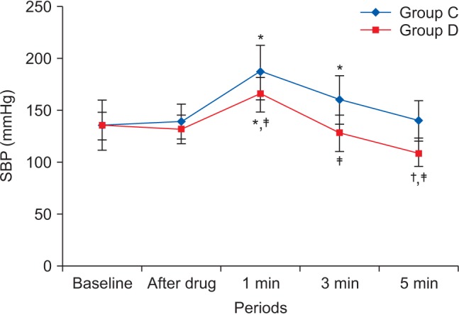
Fig. 1) that present the same information [
1]. If one wishes to compare or introduce two values at a certain time point, it is appropriate to use text or the written language. However, a table is the most appropriate when all information requires equal attention, and it allows readers to selectively look at information of their own interest. Graphs allow readers to understand the overall trend in data, and intuitively understand the comparison results between two groups. One thing to always bear in mind regardless of what method is used, however, is the simplicity of presentation.
Text presentation
Text is the main method of conveying information as it is used to explain results and trends, and provide contextual information. Data are fundamentally presented in paragraphs or sentences. Text can be used to provide interpretation or emphasize certain data. If quantitative information to be conveyed consists of one or two numbers, it is more appropriate to use written language than tables or graphs. For instance, information about the incidence rates of delirium following anesthesia in 2016–2017 can be presented with the use of a few numbers: “The incidence rate of delirium following anesthesia was 11% in 2016 and 15% in 2017; no significant difference of incidence rates was found between the two years.” If this information were to be presented in a graph or a table, it would occupy an unnecessarily large space on the page, without enhancing the readers' understanding of the data. If more data are to be presented, or other information such as that regarding data trends are to be conveyed, a table or a graph would be more appropriate. By nature, data take longer to read when presented as texts and when the main text includes a long list of information, readers and reviewers may have difficulties in understanding the information.
Table presentation
Tables, which convey information that has been converted into words or numbers in rows and columns, have been used for nearly 2,000 years. Anyone with a sufficient level of literacy can easily understand the information presented in a table. Tables are the most appropriate for presenting individual information, and can present both quantitative and qualitative information. Examples of qualitative information are the level of sedation [
2], statistical methods/functions [
3,
4], and intubation conditions [
5].
The strength of tables is that they can accurately present information that cannot be presented with a graph. A number such as “132.145852” can be accurately expressed in a table. Another strength is that information with different units can be presented together. For instance, blood pressure, heart rate, number of drugs administered, and anesthesia time can be presented together in one table. Finally, tables are useful for summarizing and comparing quantitative information of different variables. However, the interpretation of information takes longer in tables than in graphs, and tables are not appropriate for studying data trends. Furthermore, since all data are of equal importance in a table, it is not easy to identify and selectively choose the information required.
For a general guideline for creating tables, refer to the journal submission requirements
1).
Heat maps for better visualization of information than tables
Heat maps help to further visualize the information presented in a table by applying colors to the background of cells. By adjusting the colors or color saturation, information is conveyed in a more visible manner, and readers can quickly identify the information of interest (
Table 2). Software such as Excel (in Microsoft Office, Microsoft, WA, USA) have features that enable easy creation of heat maps through the options available on the “conditional formatting” menu.
Graph presentation
Whereas tables can be used for presenting all the information, graphs simplify complex information by using images and emphasizing data patterns or trends, and are useful for summarizing, explaining, or exploring quantitative data. While graphs are effective for presenting large amounts of data, they can be used in place of tables to present small sets of data. A graph format that best presents information must be chosen so that readers and reviewers can easily understand the information. In the following, we describe frequently used graph formats and the types of data that are appropriately presented with each format with examples.
Scatter plot
Scatter plots present data on the
x- and
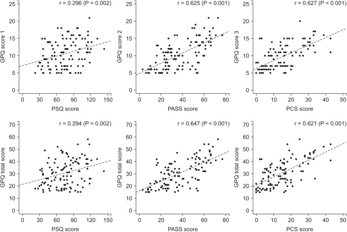
y-axes and are used to investigate an association between two variables. A point represents each individual or object, and an association between two variables can be studied by analyzing patterns across multiple points. A regression line is added to a graph to determine whether the association between two variables can be explained or not.
Fig. 2 illustrates correlations between pain scoring systems that are currently used (PSQ, Pain Sensitivity Questionnaire; PASS, Pain Anxiety Symptoms Scale; PCS, Pain Catastrophizing Scale) and Geop-Pain Questionnaire (GPQ) with the correlation coefficient, R, and regression line indicated on the scatter plot [
6]. If multiple points exist at an identical location as in this example (
Fig. 2), the correlation level may not be clear. In this case, a correlation coefficient or regression line can be added to further elucidate the correlation.
Bar graph and histogram
A bar graph is used to indicate and compare values in a discrete category or group, and the frequency or other measurement parameters (i.e. mean). Depending on the number of categories, and the size or complexity of each category, bars may be created vertically or horizontally. The height (or length) of a bar represents the amount of information in a category. Bar graphs are flexible, and can be used in a grouped or subdivided bar format in cases of two or more data sets in each category.
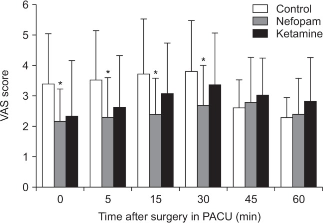
Fig. 3 is a representative example of a vertical bar graph, with the
x-axis representing the length of recovery room stay and drug-treated group, and the
y-axis representing the visual analog scale (VAS) score. The mean and standard deviation of the VAS scores are expressed as whiskers on the bars (
Fig. 3) [
7].
By comparing the endpoints of bars, one can identify the largest and the smallest categories, and understand gradual differences between each category. It is advised to start the x- and y-axes from 0. Illustration of comparison results in the x- and y-axes that do not start from 0 can deceive readers' eyes and lead to overrepresentation of the results.
One form of vertical bar graph is the stacked vertical bar graph. A stack vertical bar graph is used to compare the sum of each category, and analyze parts of a category. While stacked vertical bar graphs are excellent from the aspect of visualization, they do not have a reference line, making comparison of parts of various categories challenging (
Fig. 4) [
8].
Pie chart
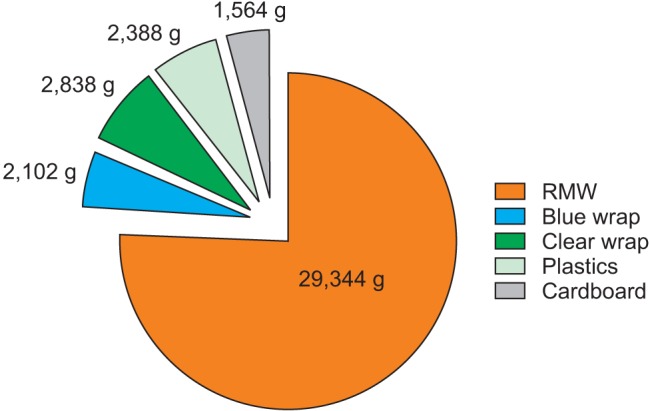
A pie chart, which is used to represent nominal data (in other words, data classified in different categories), visually represents a distribution of categories. It is generally the most appropriate format for representing information grouped into a small number of categories. It is also used for data that have no other way of being represented aside from a table (i.e. frequency table).
Fig. 5 illustrates the distribution of regular waste from operation rooms by their weight [
8]. A pie chart is also commonly used to illustrate the number of votes each candidate won in an election.
Line plot with whiskers
A line plot is useful for representing time-series data such as monthly precipitation and yearly unemployment rates; in other words, it is used to study variables that are observed over time. Line graphs are especially useful for studying patterns and trends across data that include climatic influence, large changes or turning points, and are also appropriate for representing not only time-series data, but also data measured over the progression of a continuous variable such as distance. As can be seen in
Fig. 1, mean and standard deviation of systolic blood pressure are indicated for each time point, which enables readers to easily understand changes of systolic pressure over time [
1]. If data are collected at a regular interval, values in between the measurements can be estimated. In a line graph, the x-axis represents the continuous variable, while the y-axis represents the scale and measurement values. It is also useful to represent multiple data sets on a single line graph to compare and analyze patterns across different data sets.
Box and whisker chart
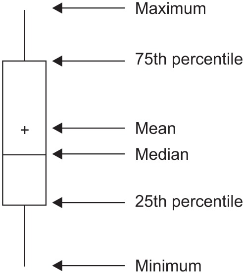
A box and whisker chart does not make any assumptions about the underlying statistical distribution, and represents variations in samples of a population; therefore, it is appropriate for representing nonparametric data. AA box and whisker chart consists of boxes that represent interquartile range (one to three), the median and the mean of the data, and whiskers presented as lines outside of the boxes. Whiskers can be used to present the largest and smallest values in a set of data or only a part of the data (i.e. 95% of all the data). Data that are excluded from the data set are presented as individual points and are called outliers. The spacing at both ends of the box indicates dispersion in the data. The relative location of the median demonstrated within the box indicates skewness (
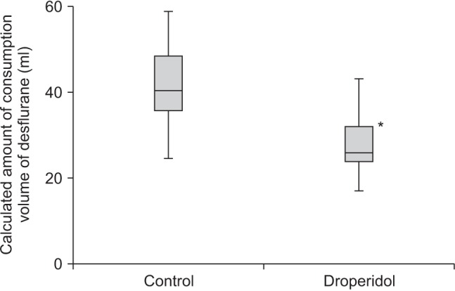
Fig. 6). The box and whisker chart provided as an example represents calculated volumes of an anesthetic, desflurane, consumed over the course of the observation period (
Fig. 7) [
9].
Three-dimensional effects
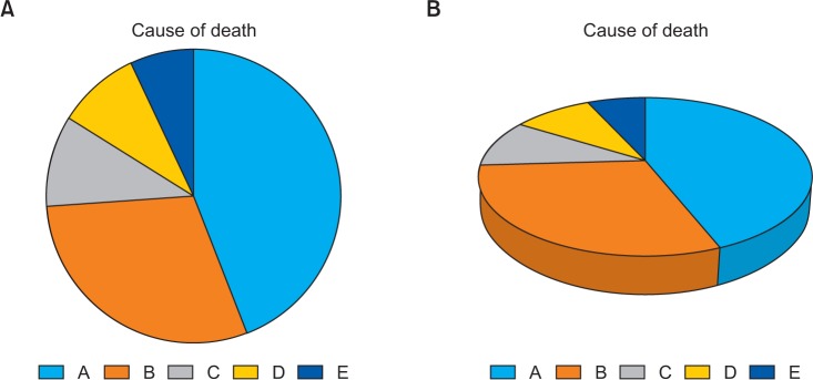
Most of the recently introduced statistical packages and graphics software have the three-dimensional (3D) effect feature. The 3D effects can add depth and perspective to a graph. However, since they may make reading and interpreting data more difficult, they must only be used after careful consideration. The application of 3D effects on a pie chart makes distinguishing the size of each slice difficult. Even if slices are of similar sizes, slices farther from the front of the pie chart may appear smaller than the slices closer to the front (
Fig. 8).
Drawing a graph: example
Finally, we explain how to create a graph by using a line graph as an example (
Fig. 9). In
Fig. 9, the mean values of arterial pressure were randomly produced and assumed to have been measured on an hourly basis. In many graphs, the x- and y-axes meet at the zero point (
Fig. 9A). In this case, information regarding the mean and standard deviation of mean arterial pressure measurements corresponding to t = 0 cannot be conveyed as the values overlap with the y-axis. The data can be clearly exposed by separating the zero point (
Fig. 9B). In
Fig. 9B, the mean and standard deviation of different groups overlap and cannot be clearly distinguished from each other. Separating the data sets and presenting standard deviations in a single direction prevents overlapping and, therefore, reduces the visual inconvenience. Doing so also reduces the excessive number of ticks on the y-axis, increasing the legibility of the graph (
Fig. 9C). In the last graph, different shapes were used for the lines connecting different time points to further allow the data to be distinguished, and the y-axis was shortened to get rid of the unnecessary empty space present in the previous graphs (
Fig. 9D). A graph can be made easier to interpret by assigning each group to a different color, changing the shape of a point, or including graphs of different formats [
10]. The use of random settings for the scale in a graph may lead to inappropriate presentation or presentation of data that can deceive readers' eyes (
Fig. 10).
Owing to the lack of space, we could not discuss all types of graphs, but have focused on describing graphs that are frequently used in scholarly articles. We have summarized the commonly used types of graphs according to the method of data analysis in
Table 3. For general guidelines on graph designs, please refer to the journal submission requirements
2).
Conclusions
Text, tables, and graphs are effective communication media that present and convey data and information. They aid readers in understanding the content of research, sustain their interest, and effectively present large quantities of complex information. As journal editors and reviewers will scan through these presentations before reading the entire text, their importance cannot be disregarded. For this reason, authors must pay as close attention to selecting appropriate methods of data presentation as when they were collecting data of good quality and analyzing them. In addition, having a well-established understanding of different methods of data presentation and their appropriate use will enable one to develop the ability to recognize and interpret inappropriately presented data or data presented in such a way that it deceives readers' eyes [
11].
Fig. 1
Line graph with whiskers. Changes in systolic blood pressure (SBP) in the two groups. Group C: normal saline, Group D: dexmedetomidine. *P < 0.05 indicates a significant increase in each group, compared with the baseline values. †P < 0.05 indicates a significant decrease noted in Group D, compared with the baseline values. ‡P < 0.05 indicates a significant difference between the groups (Adapted from Korean J Anesthesiol 2017; 70: 39-45).

Fig. 2
Scatter plot of GPQ scores and the other questionnaires. Score 1: sensitivity, 2: experience, 3: other. GPQ: Geop-Pain Questionnaire, PSQ: Pain Sensitivity Questionnaire, PASS: Pain Anxiety Symptoms Scale, PCS: Pain Catastrophizing Scale (Adapted from Korean J Anesthesiol 2016; 69: 492-505).

Fig. 3
Multiple bar graph with whiskers. Pain scores in the recovery room. *P < 0.05 compared with the control group. The nefopam group showed significant lower visual analogue scale (VAS) score at 0, 5, 15, 30, 45 and 60 minutes on postanesthesia care unit compared with the control group (Adapted from Korean J Anesthesiol 2016; 69: 480-6. Fig. 2).

Fig. 4
Stacked bar graph. Compressed volume of each component from the three operations. We checked the compressed volume of each component from the three operations; pelviscopy (with radical vaginal hysterectomy), laparoscopic anterior resection of the colon, and TKRA. TKRA: total knee replacement arthroplasty, RMW: regulated medical waste (Adapted from Korean J Anesthesiol 2017; 70: 100-4).

Fig. 5
Pie chart. Total weight of each component from the three operations. RMW: regulated medical waste (Adapted from Korean J Anesthesiol 2017; 70: 100-4).

Fig. 6
Box graph with whiskers. This graph is a standardized way of displaying the distribution of data based on the five-number summary; minimum, first quartile, median, third quartile, and maximum. The central rectangle represents from the first quartile to the third quartile (the interquartile range [IQR]). A segment inside the rectangle shows the median and “whiskers” above and below the box show the locations of the minimum and maximum.

Fig. 7
Box graph with whiskers. Calculated volume of desflurane consumed during the observation period. The groups differed significantly. Data are expressed as median, minimum, first interquartile, third interquartile, and maximum values. *P < 0.05 (Adapted from Korean J Anesthesiol 2017; 70: 27-32).

Fig. 8
Simple pie chart (A) versus 3D pie chart (B). In the 3D pie chart, slices at the rear of the chart appear smaller than those at the front because of the false perspective.

Fig. 9
Clarification of a graph. Virtual data are presented as mean with standard deviations. (A) A graph with default settings. (B) The axes are separated from each other. The data at 0 are displayed clearly. (C) The points and whiskers are jittered to avoid overlapping. Although one side of the whiskers are removed, it is still easy to understand. However, this graph still has unnecessary blank space. (D) The lines are expressed in various ways. A break is put in the y-axis. MBP: mean blood pressure.

Fig. 10
An example of misleading graphs. Both plots use the same data set. (A) The readers might be thinking that the heart rates at 1 min are higher than others. (B) The heart rates are very stable during the study. The readers should check the scale of the y-axis and baseline values when they look at the graphs.

Table 1
Modified Table in Lee and Kim's Research (Adapted from Korean J Anesthesiol 2017; 70: 39-45)
|
Variable |
Group |
Baseline |
After drug |
1 min |
3 min |
5 min |
|
SBP |
C |
135.1 ± 13.4 |
139.2 ± 17.1 |
186.0 ± 26.6*
|
160.1 ± 23.2*
|
140.7 ± 18.3 |
|
D |
135.4 ± 23.8 |
131.9 ± 13.5 |
165.2 ± 16.2*,‡
|
127.9 ± 17.5‡
|
108.4 ± 12.6†,‡
|
|
DBP |
C |
79.7 ± 9.8 |
79.4 ± 15.8 |
104.8 ± 14.9*
|
87.9 ± 15.5*
|
78.9 ± 11.6 |
|
D |
76.7 ± 8.3 |
78.4 ± 6.3 |
97.0 ± 14.5*
|
74.1 ± 8.3‡
|
66.5 ± 7.2†,‡
|
|
MBP |
C |
100.3 ± 11.9 |
103.5 ± 16.8 |
137.2 ± 18.3*
|
116.9 ± 16.2*
|
103.9 ± 13.3 |
|
D |
97.7 ± 14.9 |
98.1 ± 8.7 |
123.4 ± 13.8*,‡
|
95.4 ± 11.7‡
|
83.4 ± 8.4†,‡
|
Table 2
Difference between a Regular Table and a Heat Map
|
Example of a regular table |
Example of a heat map |
|
SBP |
DBP |
MBP |
HR |
SBP |
DBP |
MBP |
HR |
|
128 |
66 |
87 |
87 |
128 |
66 |
87 |
87 |
|
125 |
43 |
70 |
85 |
125 |
43 |
70 |
85 |
|
114 |
52 |
68 |
103 |
114 |
52 |
68 |
103 |
|
111 |
44 |
66 |
79 |
111 |
44 |
66 |
79 |
|
139 |
61 |
81 |
90 |
139 |
61 |
81 |
90 |
|
103 |
44 |
61 |
96 |
103 |
44 |
61 |
96 |
|
94 |
47 |
61 |
83 |
94 |
47 |
61 |
83 |
Table 3
Types of Charts Depending on the Method of Analysis of the Data
|
Analysis |
Subgroup |
Number of variables |
Type |
|
Comparison |
Among items |
Two per items |
Variable width column chart |
|
One per item |
Bar/column chart |
|
Over time |
Many periods |
Circular area/line chart |
|
Few periods |
Column/line chart |
|
Relationship |
|
Two |
Scatter chart |
|
Three |
Bubble chart |
|
Distribution |
|
Single |
Column/line histogram |
|
Two |
Scatter chart |
|
Three |
Three-dimensional area chart |
|
Comparison |
Changing over time |
Only relative differences matter |
Stacked 100% column chart |
|
Relative and absolute differences matter |
Stacked column chart |
|
Static |
Simple share of total |
Pie chart |
|
Accumulation |
Waterfall chart |
|
Components of components |
Stacked 100% column chart with subcomponents |


